Loading Table of Contents...
Website header: Design standards for better UX and SEO
What is a website header? Explore its structure, standard dimensions, and design examples that improve UX, conversions, and customer retention.
A website header is the interface area located at the top of a web page. It serves as the main navigation area and creates the first impression for users. This article analyzes its structure, size standards, and UI/UX optimization principles in detail. Understanding these technical foundations helps businesses retain customers more effectively, reduce bounce rates, and create a stronger foundation for SEO.
What is a website header? Its role in user experience
A website header is the first area displayed on a device screen when a user visits a URL. In web development and interface design, this term refers to the visual content shown to end users and is completely different from an HTTP header, which is a collection of background data exchanged between the server and browser.
This area usually contains the brand logo, navigation menu, and basic search tools that help define the overall information structure. Its core role is to create a strong first impression at the first visible area of the page, also known as above the fold.
User experience specialists suggest that visitors often take only a few seconds to decide whether to stay or leave after an interface has loaded. A clear navigation system helps visitors understand where they are, what services the business provides, and how they can find information that solves their problems. This can help reduce bounce rates and encourage users to stay on the website longer.
Standard structure of a professional website header
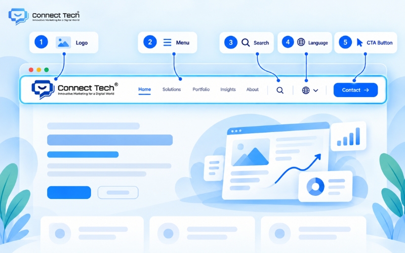
A complete header should include essential elements that support both navigation and brand recognition. Regardless of the industry, the basic structure of the top section should meet certain display standards.
When designing a header for a website, engineers usually arrange elements according to descending levels of importance. These information blocks work together to create a continuous flow that guides users naturally from brand recognition toward the final conversion action.
- Logo and brand positioning: The company logo is usually placed in the upper-left corner or center of the screen and commonly acts as a default button that returns users to the homepage.
- Main navigation bar: A hierarchical menu system containing the most important links, helping organize content categories in a clear and logical structure.
- Search and shopping cart tools: These functions allow customers to access information quickly and manage shopping items, which is especially important for retail platforms.
- Call-to-action button: Prominent buttons such as “Contact us” or “Get a quote” guide customers toward actions that can directly generate business value.
- Language switcher: This feature expands access to international audiences and is commonly used on multinational business platforms.
Website header size: Standard dimensions for PC and mobile
Determining the correct display proportions across different devices is essential to prevent layouts from breaking or covering the main content. Display dimensions can also affect how quickly users process information and how search engines evaluate the page. Setting the right website header size requires careful planning from developers to balance visual quality with practical usability.
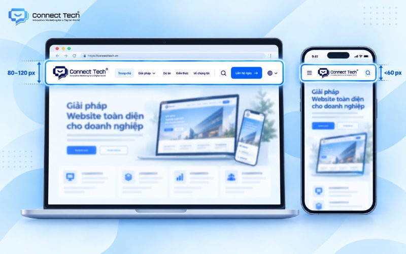
On desktop interfaces, a safe header height usually ranges from 80px to 120px, while the width can be set between 900px and 1200px or extended to full width depending on the grid system. Spacing between icons, text, and buttons should follow consistent proportional rules to reduce the risk of users clicking the wrong element.
On mobile devices, the entire menu system needs to be compressed into a much more limited space to support a mobile-first approach. The header area should generally remain within about 60px in height to avoid taking up too much of the screen and covering the main content below. A smaller logo, compact menu icon, and direct call button are three key elements that should be prioritized on vertical mobile screens.
Different industries require different website headers
Each business model requires a different information layout based on the conversion goals of its target audience. Understanding these differences helps businesses optimize the first customer touchpoint and manage traffic more strategically.
|
|
|
|
|
|
|
|
|
|
|
|
|
|
|
|
Design principles for optimizing conversion rates
Modern internet users rarely read every word on the screen. Instead, they tend to scan information following repeated visual patterns. Applying principles of visual behavior and user interaction can turn the header into a powerful tool that encourages action naturally.
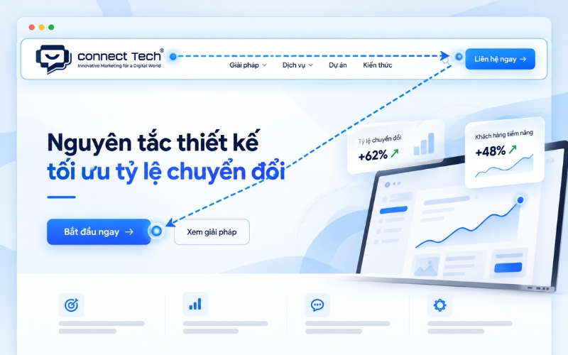
To create an attractive header for web design that also delivers strong business performance, designers often use visual flow patterns such as the F-pattern or Z-pattern. Based on these common reading behaviors, users usually begin in the upper-left corner where the logo is placed, move across the center where the navigation menu is located, and finish at the upper-right corner. This makes the upper-right area one of the most valuable positions for an important call-to-action button, helping support conversion rate optimization without creating an intrusive experience.
In addition, using a sticky header is a widely adopted design technique that improves continuous navigation. This feature keeps the top section fixed to the upper edge of the browser while users scroll down the page, allowing them to move to other pages without scrolling all the way back to the top.
On touchscreen devices, the hamburger menu, represented by three horizontal lines, also needs to be programmed carefully so that the dropdown animation remains smooth and does not interrupt the interaction flow or accidentally cover important information.
Technical considerations and page loading speed
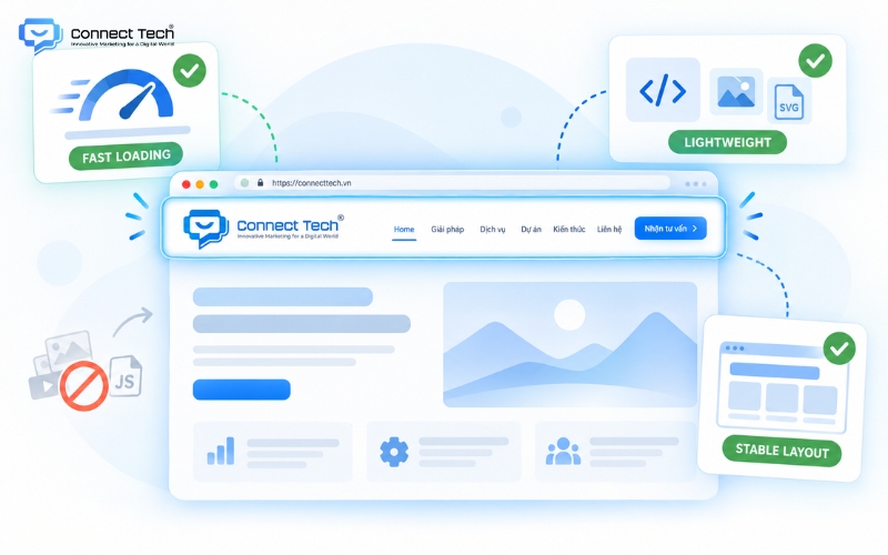
A common mistake when implementing a website header is adding too many animations, high-resolution images, or unnecessary JavaScript code. This unnecessary complexity increases response time and can negatively affect Core Web Vitals, especially Largest Contentful Paint, or LCP, and Cumulative Layout Shift, or CLS.
From a technical perspective, the source code in this area should remain lightweight and follow recognized development standards. Developers should use semantic HTML5 tags such as
Technical quality plays an important role in ensuring that the system operates smoothly and meets search engine standards. No matter how attractive or sophisticated the header looks, it will still fail if the system loads poorly and user interactions are constantly interrupted.
Popular website header trends
The digital technology market continues to change as consumer expectations increase. When searching for a suitable website header template, businesses should analyze current design trends carefully instead of applying ready-made templates without considering their specific needs.
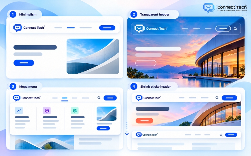
Minimalist design
This approach removes unnecessary decorative elements and keeps only the brand logo, core navigation, and one primary call-to-action button. Maximizing white space allows users to focus immediately on the most important message without being distracted by secondary information. From a technical perspective, minimalist architecture also reduces the amount of source code that needs to be downloaded, helping improve server response time and SEO performance.
Transparent header
The top section blends directly into the hero image or video below instead of being separated by a traditional solid background. This layout creates a strong sense of visual depth and gives the first screen area a modern and seamless appearance. However, designers need to calculate text color contrast carefully to maintain readability when users scroll across areas with different image brightness levels.
Visual mega menu
A large dropdown menu that covers a significant part of the screen provides enough space to include real images, illustrative icons, and detailed category hierarchies. Large corporations and e-commerce platforms often use this solution to manage substantial volumes of information. This design can significantly improve user experience because it allows customers to understand the full service or product ecosystem through a single hover interaction.
Shrink sticky header
The top section remains fixed to the upper edge of the browser while users scroll through the content below, but its height gradually becomes smaller. This design standard effectively solves two competing user needs. It keeps navigation continuously available so users can move to another page at any time, while also maximizing screen space for the main content.
Designing a header for a website requires careful planning and a balanced combination of visual design, user behavior, and page speed optimization. A properly implemented website header does more than organize information; it also helps retain visitors throughout the digital conversion journey.
If you are looking for a partner to build an SEO-friendly website that is optimized for conversions and easy to scale in the future, contact Connect Tech to receive the most suitable technology solution.
Connect Tech provides custom website design solutions that combine technology, SEO, and Digital Marketing so websites can grow alongside the business. Contact Connect Tech for advice on a solution that fits your business model and objectives.
Connect Tech - Web Design Agency
Innovative Marketing for a Digital World
Hotline: 077 317 5996
Email: info@connecttech.vn
Table of Contents
Related news
What is visual design? A foundation for better conversions
What is visual design? Learn the role of a visual designer and design and visualization fundamentals for better UX/UI and website conversions.
Standard website banner sizes for every screen
Learn standard website banner sizes for every device, plus safe zone rules, image optimization tips, and a technical SEO checklist.
Website header: Design standards for better UX and SEO
What is a website header? Explore its structure, standard dimensions, and design examples that improve UX, conversions, and customer retention.
What is a website footer? Structure and standard examples
What is a website footer? Learn its role and design principles, plus beautiful website footer UI examples and templates for better user experience.

Top 15 web design fonts for SEO and better UX/UI
Explore the best web design fonts for 2026. Learn how to choose commonly used fonts that improve UX/UI and support Vietnamese characters correctly.

What is a wireframe? Wireframe vs mockup explained
What is a wireframe? Learn the difference between wireframes and mockups and why structural sketches help businesses improve user experience.