Loading Table of Contents...
Website design dimensions for optimal UX/UI across devices
A guide to standard website design dimensions for multiple screens. Use the right sizes to improve UX/UI, conversions, and smoother development.
Website design dimensions directly affect the user experience in digital environments. A standardized set of dimensions helps interfaces display consistently, allows developers to implement HTML/CSS accurately, and reduces the risk of broken layouts. This article covers common screen dimensions, grid system principles, and responsive design practices that can help businesses improve conversion rates.
Applying consistent display dimensions from the initial design stage provides significant value for both technical teams and business objectives.
First, using the right dimensions helps reduce development risks. Front-end developers rely on standardized dimensions to build HTML/CSS structures accurately. At the same time, following standard website design dimensions helps prevent broken layouts, overflowing images, or inconsistent component proportions when the website is deployed in a real environment.
Second, consistent dimensions help optimize the customer journey. A digital platform that displays professionally and consistently across devices is more effective at retaining visitors. Users often assess a brand’s credibility through smooth visual experiences, readable text, and properly positioned interactive elements. This can in turn support the effectiveness of marketing campaigns and SEO optimization.

Standard dimensions for website design today
Understanding the resolution of each device helps designers control the available content area and create a better user experience. There are three main groups of screen dimensions to consider: desktop, tablet, and mobile.
Desktop screens
Designers commonly work with two popular resolutions: 1920x1080px and 1440x900px. A 1920px-wide screen generally represents larger desktop monitors, while 1440px is commonly used as a reference for modern laptop displays.
It is important to distinguish between the full screen width and the safe content width, or container. The main content area is often limited to around 1140px to 1200px so that users can read comfortably without having to scan too far from left to right.
Tablet screens
Tablet experiences combine the characteristics of larger screens with touch-based interaction.
Common reference dimensions are 1024x768px in landscape orientation and 768x1024px in portrait orientation. When defining web interface dimensions for tablets, designers need to leave enough space for swipe and tap interactions while limiting interface behaviors that depend on hover effects.
Mobile screens
Because smartphones are available in thousands of different resolutions, designers often use dimensions such as 375x812px or 390x844px, representing common iOS screen sizes, as baseline references.
From these initial layouts, the development team applies flexible code so the interface can automatically adapt to different smartphone screen sizes.
Mobile usage currently plays a major role among the three device categories. For this reason, a mobile-first design approach is essential. Designers need to optimize the experience for smaller screens and prioritize the most important content before expanding the layout to larger displays.
|
|
|
|
|
|
|
|
|
|
|
|
|
|
|
|
|
|
|
|
Basic guide to setting up website design dimensions in Figma
Setting up an accurate design frame in professional design software creates a strong foundation for the entire multi-device interface design project.
How to create an accurate frame
Designers use the Frame tool to define the workspace from the beginning of a new project.
Entering the correct width and height values for each frame allows interface components to be arranged according to realistic proportions. Accurate website design dimensions in Figma help the design better reflect what end users will actually see.
How to use built-in templates
Design software typically provides a library of standard screen sizes in the right-hand panel.
Instead of memorizing every dimension manually, designers can select preset frames such as “Desktop 1440” or “iPhone 14” to reduce initial setup time. This helps the project stay aligned with commonly used display specifications in the current hardware market.
How to organize and name frames
A professional design file should be well organized.
Designers should name and arrange frames according to the user flow, for example, “Homepage - Desktop” and “Homepage - Mobile,” and position related frames next to each other.
This method makes it easier for the entire team to manage the project and compare interface changes across different device versions.

Grid system and safe zones in the interface
A grid structure acts as a shared language that connects visual design concepts with practical development logic. UI/UX professionals often use a 12-column grid as the structural framework for a website.
In simple terms, this grid system is highly flexible and works well with development. The number twelve can be evenly divided by two, three, four, and six, allowing designers to divide a layout into balanced content blocks.
At the same time, this design convention works effectively with open-source frameworks such as Bootstrap, which helps make the technical handoff process smoother.
In addition to the number of columns, an interface also needs intentional white space to improve visual clarity. Designers often set gutters between columns at around 20px or 24px to clearly separate content groups.
Margins on both sides should also be carefully defined to prevent text or images from sitting too close to the edge of the screen.
While the grid system keeps the website structure and layout clear and organized, a safe zone defines the protected area for the most important business information.
The design team should position the brand logo, navigation menu, and call-to-action buttons entirely within this area. These boundaries help ensure that important interactive elements are not obscured by display cutouts, such as notches on smartphones, or cropped on devices with unusual screen proportions.

Responsive web design across multiple devices
A flexible interface allows a website to serve users effectively regardless of the device they use to access it. Businesses should consider several key factors when optimizing responsive behavior.
Breakpoints
Breakpoints are screen-width thresholds at which the interface automatically changes its layout structure to adapt to the available space.
When users resize a browser window or switch devices, the code detects the corresponding standard website design dimensions and applies an appropriate layout.
Common breakpoints are often set around 1024px for tablet layouts and 768px for mobile layouts.
Content restructuring principles
Responsive design is not simply about shrinking images.
Restructuring requires content blocks that appear side by side on desktop to be rearranged into vertically stacked sections on mobile so information remains easy to follow.
Complex navigation menus may be condensed into a hamburger menu, while long sections of text can be placed inside accordions to save screen space.
Flexible image handling and interaction
Images on responsive websites should scale flexibly according to the percentage width of their containers rather than being fixed to a specific pixel size.
Designers also need to adjust font sizes appropriately to maintain readability on mobile devices. At the same time, hover-based interactions should be adapted for touch screens through tap-based interactions, with a minimum touch target size of 44x44px.
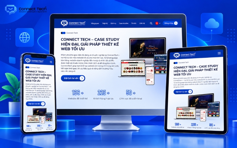
Mastering display space gives businesses a significant advantage in the digital environment by helping turn visitors into potential customers. Understanding and applying the correct website design dimensions not only helps design teams work more systematically but also supports a stable and consistent digital platform.
If you are looking for a partner to build an SEO-friendly website that is optimized for conversions and easy to scale in the future, contact Connect Tech to find a technology solution that fits your business needs.
Connect Tech provides custom website design solutions that combine technology, SEO, and Digital Marketing so websites can grow alongside the business. Contact Connect Tech for advice on a solution that matches your business model and objectives.
Connect Tech - Web Design Agency
Innovative Marketing for a Digital World
Hotline: 077 317 5996
Email: info@connecttech.vn
Table of Contents
Related news

Interior website design services optimized for conversions
Connect Tech provides premium SEO-friendly interior website design with optimized UI/UX and page speed to improve customer conversion rates.

Professional cosmetics website design to grow revenue
SEO-friendly cosmetics website design with optimized UX/UI to own customer data, build trust, and grow revenue. Get expert advice today!

What you need to know when designing a website professionally
What you need to know when designing a website: goals, UX/UI, SEO, speed, security, technology, and effective long-term operations.

What is mobile friendly? How to test and optimize for SEO
Learn what mobile friendly means and how to use mobile friendly test tools. Discover how mobile-friendly web design can improve SEO and conversions.

Website design dimensions for optimal UX/UI across devices
A guide to standard website design dimensions for multiple screens. Use the right sizes to improve UX/UI, conversions, and smoother development.

Top tools to check website speed and optimize effectively
Learn how to check website speed with accurate tools, analyze what slows your site down, and optimize website load speed to increase conversions.